The cascade strip
Chained dyadic time compression: one row of a terminal that holds ten minutes of a Geiger counter and still shows this second.
A lab report in the IEEE style, on the counts strip RadBeeper draws across the middle of radbeeper watch. Written against radbeeper 0.3.0, 17 September 2026. The technique is described first and named last, in §VIII; the short answer is that this document calls it a cascade strip, and the mechanism chained dyadic time compression.
Abstract
A live monitor has one row of a terminal -- on the order of 160 cells -- and two demands on it that ordinarily contradict each other: show what is happening now, at the resolution it is happening, and show enough of the past to say whether now is unusual. At one sample a cell, 160 cells is two minutes and forty seconds of history. This report describes the arrangement RadBeeper uses instead: four fixed-width panels drawn edge to edge in a single row, each holding k times as much time per cell as the panel on its right, with completed cells handed leftward across the panel boundaries as they age. At k = 2 and four panels of 39 to 42 columns, the row reaches back 588 seconds -- 3.7 times what a linear strip of the same width reaches -- while its rightmost cell is still one second wide. The arrangement is a visual analogue of a chain of decimating shift registers, and the report gives its invariants, its cost, the properties that make it readable, and an honest account of what in it is old and what appears not to be.
Index terms -- information visualisation, time-series display, focus+context, multi-resolution aggregation, streaming data, radiation monitoring, terminal user interfaces.
I. Introduction
A. The problem
RadBeeper reads a GQ GMC-320 Plus Geiger-Müller counter once a second and draws the result in a terminal. Radioactive decay is a Poisson process, so a single second of counts is mostly noise: at a background of 40 CPM, a one-second sample is 0 counts about half the time and 1 count most of the rest. A reading is only a reading against its own history. The display therefore has to answer two questions at once:
- What is the counter doing this second? -- which needs one second of resolution, because the arrival of an individual count is the event.
- Is this second unusual? -- which needs minutes to tens of minutes of context, because that is the timescale on which background drifts, somebody walks past with a source, or a rain shower washes radon daughters out of the air.
The display budget for both is one band of a text terminal: 160 columns wide and five rows tall in the reference layout, sharing the screen with five averaging windows, a log table and a periodicity estimate.
B. What does not work
One second a column. 160 seconds of history, at full resolution, and no answer to question 2. The band shows a spike and cannot say whether an identical spike happened four minutes ago.
One minute a column. 160 minutes of history, and no answer to question 1. The second-by-second arrival structure -- which is what makes a Geiger counter interesting to watch, and what the spectrum panel below it analyses -- is averaged away before it is drawn.
Two separate charts. This is what monitoring systems built on RRDtool [1] conventionally do: a "last hour" graph and a "last day" graph, side by side or on separate pages. It answers both questions, at the cost of the reader's eye having to leave one chart, find the other, and re-establish where in it "now" is. In a band five rows tall there is no room for two charts with two axes and two scales.
Distortion of a single axis. Fisheye and bifocal treatments [2], [3] compress the context continuously, so that a column's width in time is a smooth function of its age. This works, and is the closest published relative of what is described here, but a continuously varying cell width is awkward in a character grid, where a cell is one column or it is nothing, and it makes a bar's meaning ("how much time is this?") a per-column question.
C. What this report describes
The counts strip is four panels of roughly equal width, drawn edge to edge in one band, sharing one vertical scale and one colour scale:
 8s/bar · 5m          F 4s/bar · 3m         F 2s/bar · 78s        F 1s/bar · 42s
└─────── 312 s ──────┘└────── 156 s ───────┘└───── 78 s ─────────┘└──── 42 s ────┘
          oldest  ←──────── time flows right to left ────────→  now, one second a bar
Each panel holds twice as much time in a bar as the panel to its right. A second arrives at the right edge of the rightmost panel. As it ages it marches left, one column a second, until it falls off the left edge of that panel -- at which point it does not disappear: it is merged with its neighbour into a single two-second bar entering the right edge of the next panel along. Two of those bars in turn become one four-second bar in the third panel, and two of those become one eight-second bar in the fourth. Each boundary is a halving, and the halvings chain.
The result reaches back 588 seconds in 159 columns, with a rightmost bar one second wide. A linear strip of the same width reaches 159 seconds. Adding a fifth panel of the same width would reach 1212 seconds, a sixth 2460; the reach grows geometrically in the number of panels while the display cost grows linearly.
II. Related work
The cascade strip sits at the junction of two literatures that rarely cite each other: the storage-side one, concerned with keeping a bounded summary of an unbounded stream, and the display-side one, concerned with showing a detail and its context at once.
A. Storage-side: aging summaries of a stream
Round-robin archives. RRDtool [1] is the canonical instance and the direct ancestor of every monitoring system's retention policy. A round-robin database holds several round-robin archives over the same stream, each with its own consolidation factor: 600 samples at 1 minute, 700 at 5 minutes, 775 at 30 minutes, 797 at 2 hours. Primary data points are consolidated -- by mean, minimum or maximum -- into the coarser archives as they arrive, and each archive is a circular buffer, so the file never grows. The storage structure of the cascade strip is exactly an RRA set with consolidation factor 2 between neighbours; what is different is that RRDtool's archives are drawn separately, one graph per timescale, and the cascade strip draws them adjacent, in one row, as one picture.
Exponential histograms. Datar, Gionis, Indyk and Motwani [4] give the sliding-window counting structure that underlies much of the streaming literature: buckets whose sizes grow exponentially with age (1, 1, 2, 4, 8, ...), merged pairwise as they age out, answering a windowed count within a 1 + ε factor in O(ε⁻¹ log² N) bits. The pairwise merge-on-aging is precisely the hand-off across a cascade boundary. The difference is one of purpose: an exponential histogram is a data structure with an error bound, from which no particular picture follows; the cascade strip is a picture, in which the merge happens at a boundary the reader can see and the bucket sizes are chosen to be legible rather than optimal.
Wavelets and pyramids. Successive halving of resolution is the Haar pyramid, and multi-resolution analysis is the standard signal-processing frame for it. A cascade strip is a Haar approximation pyramid in which each level is shown as a strip of its own, with the levels laid end to end in their natural temporal order rather than stacked.
B. Display-side: detail and context in one picture
Bifocal display. Spence and Apperley [2] gave the first focus+context visualisation: a detailed strip with the material on either side horizontally compressed into narrow bands, described through a metaphor of paper stretched over four rollers. The cascade strip is a one-sided bifocal display with the compression quantised into discrete steps instead of applied continuously -- a bifocal display for a character grid.
Fisheye and generalised focus+context. Furnas's degree-of-interest function and the distortion-oriented surveys that followed [3] formalise the allocation of display space in proportion to interest. The cascade strip's degree-of-interest function is recency, and its space allocation is a step function of it: constant within a panel, halving at each boundary.
Space-efficient time series. Horizon graphs [5] attack the same budget problem in the other dimension -- vertical rather than horizontal -- by layering bands of value range, and Heer, Kong and Agrawala's experiments establish that readers tolerate substantial compression before accuracy falls off. The cascade strip is that argument applied to the time axis, and the two compose: nothing prevents a cascade strip whose panels are drawn as horizon graphs.
Multi-resolution aggregation. Hao, Dayal, Keim and Schreck [6] allocate display space to sub-intervals of a long series in proportion to their degree of interest, with the recent data at the highest resolution and older intervals progressively aggregated. This is the closest published relative in the visualisation literature. It differs in being an interactive exploration tool for a stored series, with data-dependent interval boundaries, where the cascade strip is a live monitor with fixed, arithmetically-defined boundaries that never move.
C. Patent literature
This idea has been claimed. A continuation family assigned to Trading Technologies International, with a priority date of 31 March 2004 [7], claims a time axis divided into regions each with its own linear scale -- a recent region and one or more older regions, together forming a non-linear axis -- where new data enters the recent region and the oldest data previously in it is automatically shifted into the older region as it ages. Stated that generally, it is the mechanism described in this report, arrived at for financial charting rather than instrument monitoring. Related claims cover time-relevance-based nonlinear distortion of a series [8].
Anyone intending to build a product on this should read [7] properly. What we did not find in the claims we read is the specific chain of equal-width panels at a constant factor with a drawn, labelled hand-over -- but the absence of a thing from a patent's claims is a question for a lawyer, and this report is not one. The technique is old enough and obvious enough to have been independently invented repeatedly, which is itself evidence that it is the right answer to the problem.
III. The technique
A. Definition
A cascade strip of T tiers over a stream of per-second samples is defined by a compression factor k ≥ 2 and a column count *c*ᵢ for each tier, numbered from the finest, i = 0, at the right:
- tier i draws *c*ᵢ bars;
- each bar of tier i covers *k*ⁱ consecutive samples;
- tier i therefore spans *c*ᵢ · *k*ⁱ seconds;
- the strip spans Σ *c*ᵢ · *k*ⁱ seconds in Σ *c*ᵢ columns.
With equal widths *c*ᵢ = c, the strip spans c · (*k*ᵀ − 1)/(k − 1) seconds: geometric in T, linear in display cost. RadBeeper uses T = 4, k = 2, and c = ⌊w/4⌋ with the remainder given to the finest tier, so at w = 159: 42, 39, 39, 39 columns and 42 + 78 + 156 + 312 = 588 seconds.
k is not fixed at 2 by the technique. RadBeeper chooses the smallest whole k ≥ 2 whose strip reaches back at least as far as the periodicity estimator below it looks, so that the two panels are views of the same stretch of time; in ordinary operation that is 2, and the display says which it is in every tier's label (4s/bar).
B. Invariants
These are what make the picture readable, and they are what the tests in src/analysis.rs assert:
- I1 -- Alignment. A bar of tier i covers samples [g·*k*ⁱ, (g+1)·*k*ⁱ) for an integer g. Bar edges are fixed to the sample count, not to the screen. A bar therefore does not change as the strip scrolls under it: the only bar in a tier whose value can change is the newest, and only until it is full.
- I2 -- Conservation. Every second that leaves a tier arrives in the tier to its left. Nothing is dropped at a boundary, and nothing is counted twice: tier i+1's newest group begins exactly where tier i's oldest drawn bar begins.
- I3 -- Means, not sums. A bar's value is the arithmetic mean of the counts per second it covers, so that the same bar height means the same rate in every tier. Summing would make an 8-second bar eight times as tall as a 1-second bar of identical intensity, and the strip would read as a ramp.
- I4 -- One scale. All tiers share one vertical scale and one colour scale, both taken over the whole strip. Nothing in the picture invites the reader to compare a height in one panel against a different scale in the next.
C. The shift-register analogy
The reader's model of the mechanism, and the one this report recommends teaching, is hardware: each tier is a shift register clocked at 1/*k*ⁱ Hz, and each boundary is a divide-by-k stage. A sample is clocked into stage 0 every second. Every k ticks, stage 0's overflow clocks stage 1; every k ticks of that, stage 1's overflow clocks stage 2. The picture is the contents of all four registers, laid out in the order the data flows through them. What a barrel shifter does to bits in one cycle, this does to seconds over ten minutes.
D. Cost
Drawing is O(Σ *c*ᵢ) per frame. A standalone implementation needs Σ *c*ᵢ accumulators plus T partial sums -- under 200 numbers for the layout above -- and no history at all; RadBeeper instead recomputes the strip each frame from the sample buffer its averaging windows already keep, because that buffer exists anyway and recomputation makes I1 trivially true rather than a thing to maintain across a resize.
The reach of a strip with T equal tiers of c columns is c·(*k*ᵀ−1)/ (k−1); RadBeeper's fine tier carries the three columns that do not divide, so its reach is 42 + 39·(*k*ᵀ−k)/(k−1). At k = 2 that is 42 s for one tier, 120 s for two, 276 s for three, 588 s for four, 1212 s for five and 2460 s for six. The marginal panel always doubles what came before it.
IV. Why it reads
Recency is spatial. The eye lands on the right edge -- the newest bar, at the widest resolution the instrument offers -- and everything to the left is older and coarser in the same direction. There is no legend to consult to know which way time runs: the newest bar is under the number it produced.
The seam is a feature, not an artefact. At each boundary the bar width in time doubles. The strip does not hide this: each tier is labelled with its own resolution and reach (4s/bar · 3m), and each boundary carries an F where a finer tier hands over. A reader who does not notice the seam will misread a spike's duration by a factor of two; a reader who has noticed it once never misreads it again. Hiding the compression -- drawing it as one continuous axis with no marks -- would be the error.
Constant ink per second, within a tier. Because tiers are internally linear, the ordinary strip-chart reading ("this bump is twice as wide as that one, so it lasted twice as long") holds inside a panel. It is only across a boundary that the reader must apply the factor, and the label says what the factor is.
Variance falls with age, and that is correct. A one-second bar of a Poisson process at 40 CPM has a standard deviation comparable with its mean; an eight-second bar of the same process has one about 2.8 times smaller relative to it. The coarse end of the strip is quieter than the fine end because it is averaged, which is exactly the property wanted from context: the left of the strip shows the trend, the right shows the arrivals.
The trade is stated honestly by the picture itself. A transient shorter than 8 seconds is visible in full at the right and is smeared into a single bar by the time it reaches the left. This is unavoidable in any bounded summary, and the alternative -- dropping the old data entirely -- is worse and less honest.
V. Implementation
In src/analysis.rs, tiers() returns a Vec<Tier> coarsest-first, each tier carrying its column count, its seconds-per-bar and its values as Option<f64> -- None, not zero, where the sample does not exist yet, so that a monitor started 20 seconds ago draws 20 bars and not 588. src/main.rs renders them left to right with one shared peak and one colour ramp, writes each tier's label above its first column, and marks the hand-over columns. Roughly 60 lines for the model and 40 for the drawing, in a program whose only dependency is libc.
Two details earned their tests:
- Widths. The fourth tier was taken out of the fine tier's allocation, which had been half the strip. One second a bar for 42 seconds is as much of the present as a reader uses; the columns it gave up bought a doubling of the past.
every_tier_leftwards_is_one_more_doublingasserts the property rather than the layout, so the constants can move and the shape cannot. - The still-filling bar. The newest bar of every coarse tier is a partial mean, over however many of its *k*ⁱ seconds have arrived. Drawing it as a full bar would make the leftward edge of each panel flicker as it fills; drawing it as
Nonewould make the strip appear to have a gap. It is drawn as the mean of what it has, which is also what it will keep.
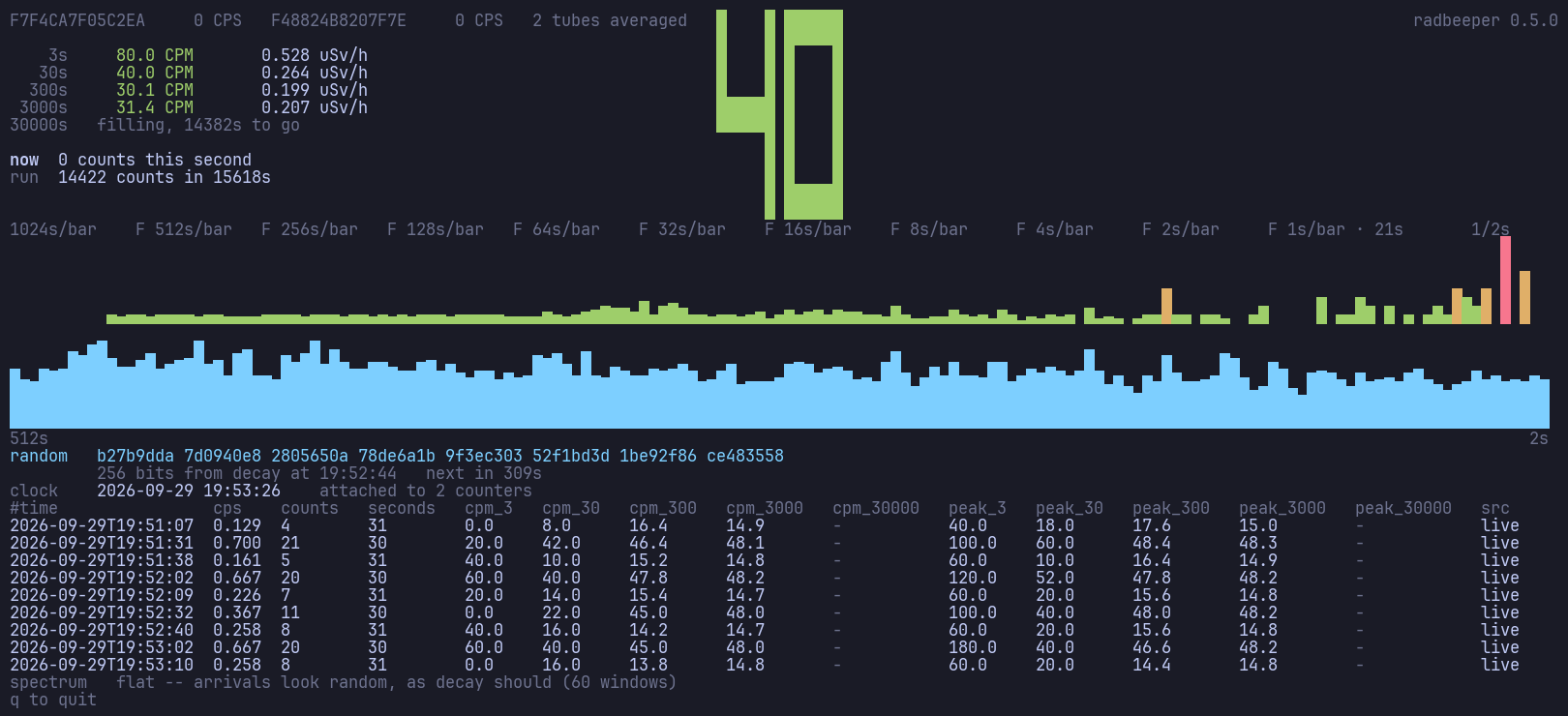
The counts strip -- four tiers deep in that picture, eleven since 2026-09-29, out to 1024 seconds a bar -- is the wide band across the middle of docs/screenshots/watch.png; the README's animation shows it filling, tier by tier, over the first ten minutes of a session.
VI. What the recording shows
The verification run is a single 680-second session against the counter these logs came from, recorded through a pty at 160 × 40 and reproduced by make promo. Read left to right, the strip fills in the order the technique predicts, and the fill times are the arithmetic above, not a tuning:
| tier | bar | columns | full after | what it shows first |
|---|---|---|---|---|
| fine | 1 s | 42 | 42 s | individual counts arriving |
| 2nd | 2 s | 39 | 78 s | the first hand-over, F marked |
| 3rd | 4 s | 39 | 156 s | a minute-scale trend |
| 4th | 8 s | 39 | 312 s | the whole session as context |
No user study was run. This section reports that the implementation behaves as specified, not that readers understand it better than they understand the alternatives; §IX says what such a study would have to measure.
VII. Novelty, honestly
Old: aging a stream through a chain of factor-k consolidations (RRDtool RRAs [1], exponential histograms [4], Haar pyramids); allocating display space by recency (bifocal displays [2], fisheye and degree-of-interest [3], multi-resolution aggregation [6]); dividing a time axis into regions of differing linear scale with data migrating between them as it ages, which is claimed, with a 2004 priority date, in [7].
What we did not find in the literature we read: the combination of (a) equal-width panels chained at a constant factor, so that each panel leftwards costs the same columns and buys twice the time; (b) the hand-off boundary drawn as a labelled, visible feature of the picture rather than smoothed away; (c) all panels sharing a single value and colour scale so that the strip reads as one chart; and (d) the whole thing in one row of a character grid, where the quantisation the technique imposes is not a compromise but a match to the medium.
That is a composition claim, not an invention claim, and the honest summary is: the parts are standard, the assembly appears not to be, and the assembly is what makes it work in 160 columns.
VIII. Naming
The technique needs a name that says what it does, survives being said out loud, and does not overclaim.
Recommended.
- Cascade strip -- the picture. Short, says the essential thing (stages, each feeding the next), and "strip" places it in the strip-chart family where a reader should look for it.
- Chained dyadic time compression (CDTC) -- the mechanism, for a paper's index terms. Dyadic is the standard word for factor-2 subdivision in the wavelet literature and generalises honestly: at k = 3 it is chained triadic compression, and chained geometric time compression covers both.
Also considered, with what each gets right and wrong.
| name | for | against |
|---|---|---|
| time-compression cascade | reads as plain English | buries the word that says it is a chart |
| dyadic history strip | names the factor and the content | "history" understates that the right edge is live |
| barrel-shift chart | the hardware analogy is the clearest teaching model | a barrel shifter shifts by many positions in one cycle; this shifts by one and divides. Wrong in the detail that specialists would check |
| decimating strip chart | "decimation" is exactly the DSP operation | reads as "throwing data away" to a non-DSP audience, and the data is averaged, not dropped |
| logarithmic time strip | says the reach is exponential in the panel count | the axis is piecewise linear, not logarithmic; a reader would expect a smooth log scale |
| waterfall strip | evokes flow | "waterfall" already means a spectrogram-over-time plot, and the collision would be permanent |
| recency cascade | names the degree-of-interest function | says nothing about what happens at the boundaries |
This document uses cascade strip throughout, and chained dyadic time compression where the mechanism rather than the picture is meant.
IX. Limitations and future work
- No evaluation with readers. The claims in §IV are design arguments and a Poisson variance calculation, not measurements. The study that would settle it is the horizon-graph study [5] with the time axis as the manipulated factor: accuracy and speed at "how long did that last?" and "when did that happen?" against a linear strip and against two separate charts of the RRDtool kind, at matched display area.
- Short transients at the coarse end. Bounded and stated, but a reader who needs "was there a one-second spike nine minutes ago?" must go to the log, not the strip. A per-bar maximum drawn behind the mean -- the RRA MAX consolidation [1] as a second, dimmer layer -- would recover it, and is the obvious next experiment.
- Resize. The tier widths are recomputed from the terminal width, so a resize re-cuts the boundaries and the bars jump once. Fixed alignment (I1) means the data is unchanged; only its grouping moves.
- Colour. The strip encodes rate in colour bands as well as height, which helps at one and two rows of height and is redundant at five. Its behaviour for colour-blind readers has not been checked.
- Generalisation. Nothing in the technique is specific to radiation. Any once-a-second scalar -- packets, watts, request latency -- has the same problem in the same width. The parameters worth tuning per domain are k and T, and both are one line.
References
[1] T. Oetiker, "RRDtool -- round robin database tool," documentation and source, 1999-present. [Online]. Available: https://oss.oetiker.ch/rrdtool/ -- see the RRA/consolidation model described in rrdcreate(1) and summarised at https://en.wikipedia.org/wiki/RRDtool
[2] R. Spence and M. Apperley, "Data base navigation: an office environment for the professional," Behaviour and Information Technology, vol. 1, no. 1, pp. 43-54, 1982; and "A bifocal display technique for data presentation," Proc. Eurographics, 1982. [Online]. Available: https://diglib.eg.org/handle/10.2312/eg19821002
[3] A. Cockburn, A. Karlson and B. B. Bederson, "A review of overview+detail, zooming, and focus+context interfaces," ACM Computing Surveys, vol. 41, no. 1, pp. 1-31, 2008. [Online]. Available: https://www.microsoft.com/en-us/research/wp-content/uploads/2008/01/cockburn-ComputingSurveys09.pdf
[4] M. Datar, A. Gionis, P. Indyk and R. Motwani, "Maintaining stream statistics over sliding windows," SIAM Journal on Computing, vol. 31, no. 6, pp. 1794-1813, 2002. [Online]. Available: http://www-cs-students.stanford.edu/~datar/papers/sicomp_streams.pdf
[5] J. Heer, N. Kong and M. Agrawala, "Sizing the horizon: the effects of chart size and layering on the graphical perception of time series visualizations," Proc. ACM CHI, pp. 1303-1312, 2009. [Online]. Available: https://idl.cs.washington.edu/files/2009-TimeSeries-CHI.pdf
[6] M. C. Hao, U. Dayal, D. A. Keim and T. Schreck, "Multi-resolution techniques for visual exploration of large time-series data," Proc. EuroVis (Eurographics/IEEE-VGTC Symp. on Visualization), pp. 27-34, 2007, doi:10.2312/VisSym/EuroVis07/027-034. [Online]. Available: https://bib.dbvis.de/uploadedFiles/96.pdf
[7] "Graphical display with integrated recent period zoom and historical period context data," Trading Technologies International, Inc., priority date 31 March 2004; U.S. Patents 8,269,774; 8,395,625; 8,537,161; 9,542,709; 9,852,530; 10,062,189; 10,275,913; 10,467,784; 10,643,357; 11,010,942 (a continuation family). [Online]. Available: https://patents.google.com/patent/US11010942B2/
[8] "Time relevance-based visualization of data," U.S. Patent 7,924,283. [Online]. Available: https://patents.google.com/patent/US7924283B1/
MIT License — Copyright (c) 2026 Paul Richeson